
Portfolio
Scroll down to view
Portfolio
Scroll down to view
INTERACTION DESIGN:
EVENTS APP PROTOTYPE
The Problem: Many medium and large churches struggle with an easy way to give their congregations (or the public) access to ticketed events. Going through third party sites is often cost-prohibitive, and they don’t contain the specific functionality that the church or organization is looking for.
Actions: In thinking through the possibilities for this app, I knew it had to solve the current issues plaguing larger churches. The three most important interaction pieces needed to allow users to:
Browse, share, and save events
Reserve tickets to events
Send tickets to someone else
Put ticket control back into the hands of the user by providing the ability to delete orders and/or individual tickets. This feature is especially important when the church events are large enough that they are drawing a significant crowd, but the church itself doesn’t have a full-time customer support team to manage all the orders and requests, or the funding to hire out a third party ticketing agency
Originally, there was a plan to have the app be a “all-in-one” events management app that would allow event organizers to recruit volunteers, scan tickets on the event date, and incorporate real-time tracking of event attendance. However, prototyping all these features would not have been possible given the time constraints of the project. In order to do a few things well, the app’s complexity had to be scaled back.
Results: To the left, is an interactive prototype of this events app. It features a simulation of all four of the most important user interaction: browse/share/save, reserve tickets, edit tickets, send tickets.
Lessons Learned: Throughout the process, I learned that app creation must be systematic, and the goals must be attainable. Initially, this app started out as too ambitious. By reducing the scope, the project became more manageable. I was disappointed that I had to scale it back, but I wanted to do a few things well and with higher fidelity, rather than do many things with average or incomplete interaction. I learned the ins-and-outs of prototyping through Proto.io, an web interface that is fairly intuitive and offers sophisticated interaction. I also learned that just because I use apps every day, it didn’t mean that I knew right away how to design one. Everything from the log-in process to the profile screen, I had to research to understand what needed to exist on the screens, in what order, etc.
BOOKS
Jacket and Interior Design
Poet and writer Mary Quade had very specific ideas about the image she wanted on the cover of her book. The poems inside grapple with our connection and lack of connection to nature, so it was important for Sarah to capture that symbolism on the cover, illustrated through the transparent but distressed white bar, the simplicity, but uniqueness of the font, and the rich textures, subtly overlayed on the photograph in order to highlight the dead mole.
A novel in three parts, The Prince of Mars is the story of death row inmates sent to Mars to build mankind's first colony. While fiction, it has firm roots in the political theories of Machiavelli, and it was that blending of history, adventure, and tragedy that the author wanted for the cover. The cover photograph used is an actual Martian landscape, taken by the Exploration Rover Spirit, from the Public Domain. Sarah then employed the use of gritty textures, light filters, a heavy-weight and imposing but no frills font, and composited a figure heading off alone into the horizon, a foreshadowing of the third act in the book.
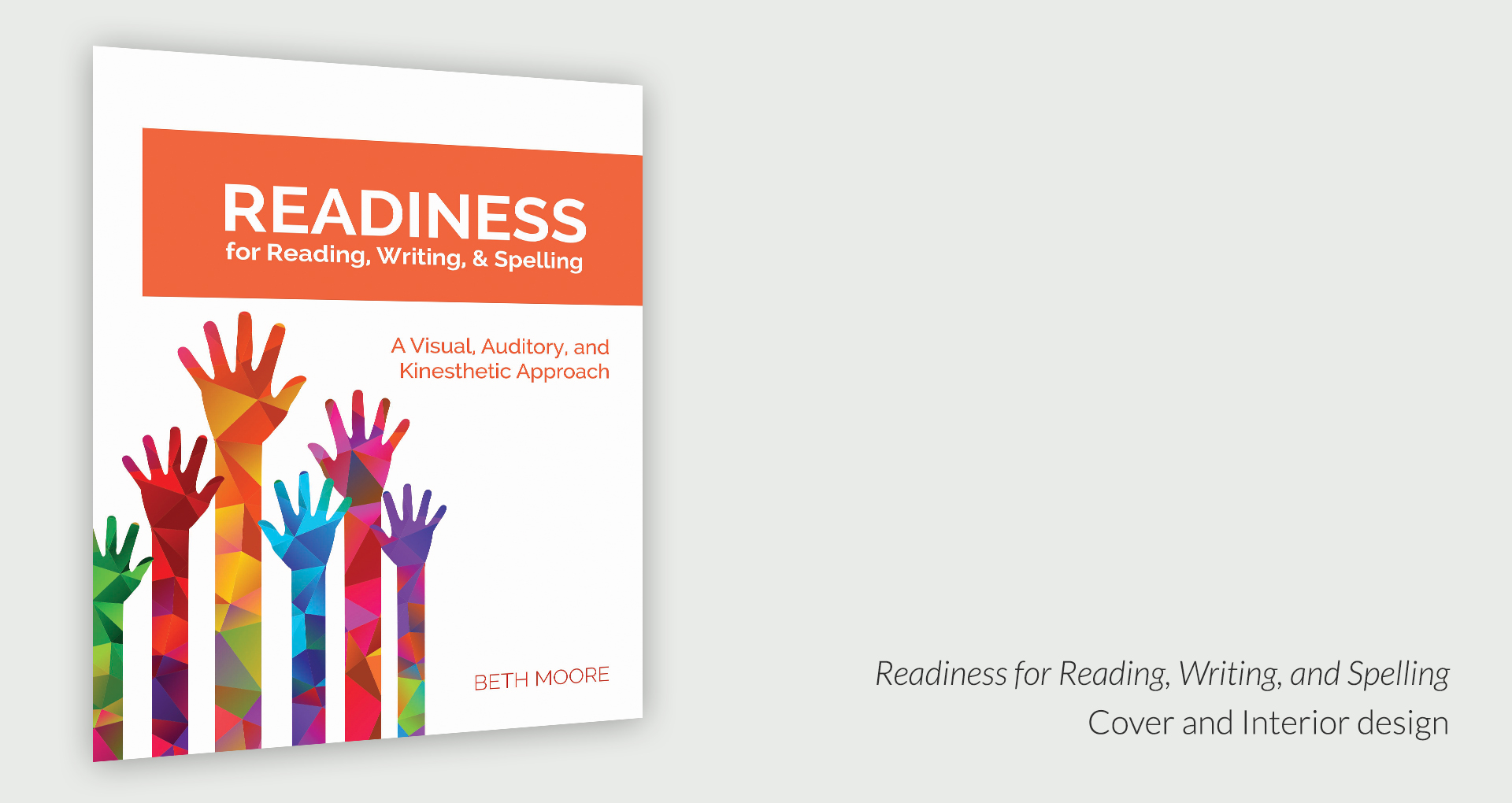
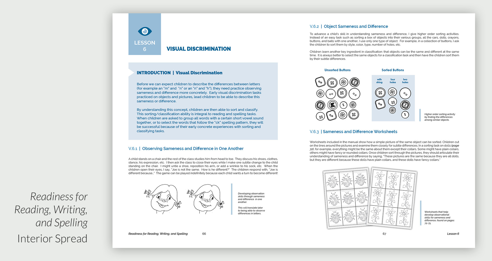
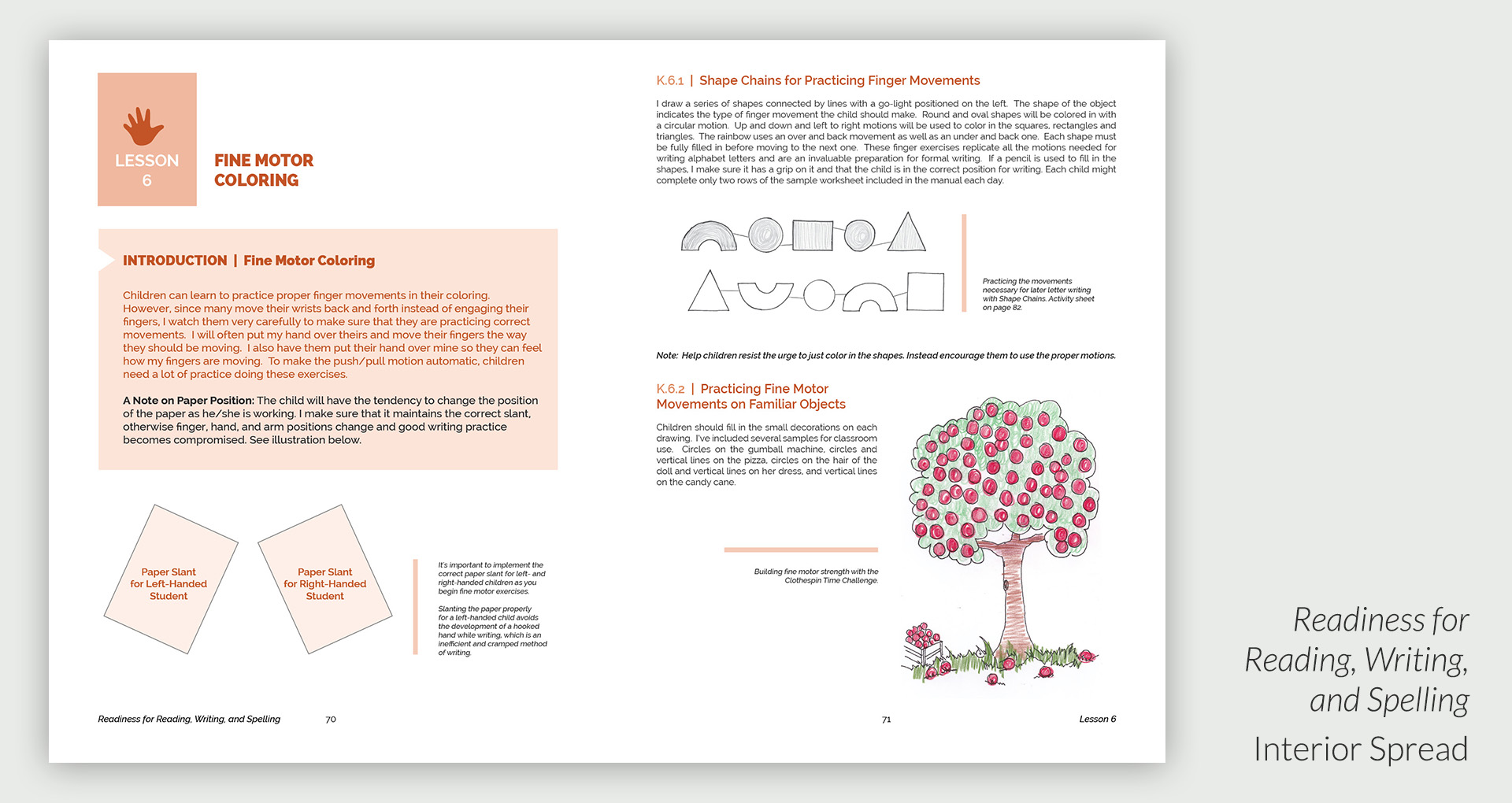
Readiness for Reading, Writing, and Spelling is currently in process with an anticipated publication date of April 2017. Since this is a second edition teaching manual, Sarah wanted the design in this project to bear some resemblance to the first book, which she also designed. Color is of extreme importance here, as the teaching approach takes each learning channel--visual, auditory, and kinesthetic--and works with each one independently throughout the majority of the book. Ease of use is also essential, and so the design is simple and clean.
GRIN RESCUE
Logo, Stationery, Social Media
Sarah worked with Golden Retrievers In Need (GRIN), a Northeast Ohio Golden Retriever rescue service
to update their logo, stationery, and social media and website banners.
EMERGING WRITERS NONFICTION CONTEST
Logo, Poster, and Postcard
In 2014, Hiram College's Lindsay-Crane Center for Writing and Literature created a nonfiction contest for
ninth and tenth grade students. They asked Sarah to create the logo and design the collateral material for the contest.
LINDSAY-CRANE CENTER FOR WRITING AND LITERATURE
Newsletter Design
In 2012, Hiram College's Lindsay-Crane Center for Writing and Literature launched its first newsletter. Sarah was tasked with creating a design that complemented the College's overall style and branding, while still providing a unique appeal for this new digital magazine.
Below are a few of the interior spreads from amaranth.
HIRAM COLLEGE COMMUNITY READING PROGRAMS
Event Guides, Posters, and Newspaper Ads
GENERAL ADVERTISING
Posters, Postcards, Digital Ads, Inserts, Media Banners, and Brochures


